Wednesday, February 28, 2018
We've Moved!
Hi everyone! As a part of a revamp of the Spring Forecasting Experiment web tools, we have decided to move the blog over to the NSSL blog page. You can now find us at: https://blog.nssl.noaa.gov/efp/. Any new posts, including coverage of our upcoming SFE 2018, will be posted there. And trust me when I say this upcoming Spring Forecasting Experiment has some fun things in the works! The organizational crunch time is in full swing, and we're pretty excited about what we have upcoming this year. So stay tuned!
Wednesday, June 14, 2017
SFE 2017 Wrap-Up
The 2017 SFE drew to a close a little over a week and a half ago, and on behalf of all of the facilitators, I would like to thank everyone who participated in the experiment and contributed products. Each year, preparation for the next experiment begins nearly immediately after the conclusion of the SFE, and this year was no exception.
This SFE was busier than SFE 2016, in that the Innovation Desk forecast a 15% probability of any severe hazard every day during the experiment - and a 15% verified according to the practically perfect forecasts based on preliminary LSRs. This was despite having a relatively slow final week. Slower weeks typically occur at some point during the experiment, and enhance the operational nature of the experiment. After all, SPC forecasters are working 365 days a year, whatever the weather may be! The Innovation Desk also issued one of their best Day 1 forecasts of the experiment during the final week, successfully creating a gapped 15%. If you read the "Mind the Gap" post, you know the challenges that go into a forecast like this:

This forecast was a giant improvement to the previously-issued Day 2 forecast, which had the axis of convection much too far north:

As for other takeaways from the experiment, the NEWS-e activity introduced an innovative tool for the forecasters, and will likely continue to play a role in future SFEs. Leveraging convection-allowing models at time scales from hours (i.e., NEWS-e, the developmental HRRR) to days (i.e., the CLUE, FVGFS) allows forecasters to understand the current capabilities of those models. Similarly, researchers can see how the models are performing under severe convective conditions and target areas for improvement. A good example of this came from comparing different versions of the FVGFS - two different versions were run with different microphysics schemes, and produced different-looking convective cores. Analyzing the subjective and objective scores post-experiment will allow the developers to improve the forecasts. For anyone interested in keeping up with some of these models, a post-experiment model comparison website has been set up. Under the Deterministic Runs tab, you can look at output for the FVGFS, UK Met Office model, the 3 km NSSL-WRF, and the 3 km NAM from June 5th onward.
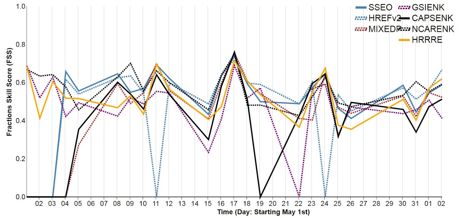
Much analysis remains to be done on the subjective and objective data generated during the experiment. Preliminary Fractions Skill Scores (FSSs) for each day:

and aggregated across the days for each hour:

This SFE was busier than SFE 2016, in that the Innovation Desk forecast a 15% probability of any severe hazard every day during the experiment - and a 15% verified according to the practically perfect forecasts based on preliminary LSRs. This was despite having a relatively slow final week. Slower weeks typically occur at some point during the experiment, and enhance the operational nature of the experiment. After all, SPC forecasters are working 365 days a year, whatever the weather may be! The Innovation Desk also issued one of their best Day 1 forecasts of the experiment during the final week, successfully creating a gapped 15%. If you read the "Mind the Gap" post, you know the challenges that go into a forecast like this:

This forecast was a giant improvement to the previously-issued Day 2 forecast, which had the axis of convection much too far north:

As for other takeaways from the experiment, the NEWS-e activity introduced an innovative tool for the forecasters, and will likely continue to play a role in future SFEs. Leveraging convection-allowing models at time scales from hours (i.e., NEWS-e, the developmental HRRR) to days (i.e., the CLUE, FVGFS) allows forecasters to understand the current capabilities of those models. Similarly, researchers can see how the models are performing under severe convective conditions and target areas for improvement. A good example of this came from comparing different versions of the FVGFS - two different versions were run with different microphysics schemes, and produced different-looking convective cores. Analyzing the subjective and objective scores post-experiment will allow the developers to improve the forecasts. For anyone interested in keeping up with some of these models, a post-experiment model comparison website has been set up. Under the Deterministic Runs tab, you can look at output for the FVGFS, UK Met Office model, the 3 km NSSL-WRF, and the 3 km NAM from June 5th onward.
Much analysis remains to be done on the subjective and objective data generated during the experiment. Preliminary Fractions Skill Scores (FSSs) for each day:
and aggregated across the days for each hour:

give a preliminary metric of each ensembles' performance. The FSS looks at the number of gridboxes covered by a phenomenon (in this case, reflectivity) within a certain radius in the forecast and the observations, therefore eliminating the problem of double penalization incurred when a phenomenon is slightly displaced between the forecasts and the observations. The closer the score is to one, the better it is. Now, there are some data drop-outs in this preliminary data, but it still looks as though the SSEO is performing better than most other ensembles. Aggregated scores across the experiment place the SSEO first, with an FSS of .593. The HREFv2, which is essentially an operationalized SSEO with some differences in the members, was second, with an FSS of .592. Other high-performing ensembles include the NCAR ensemble (.580) and the HRRR ensemble (.559). Again, this data is preliminary, and these numbers will likely change as the cases that didn't run on time in the experiment is rerun.
As for what SFE 2018 will hold, discussions are already underway. Expect to see more of the CLUE, FVGFS, and NEWS-e. A switch-up in how the subjective evaluations are done and revamp of the website is also in the pipeline. Even as the data from SFE 2017 begins to be analyzed, we look forward to SFE 2018 and how we can continue to improve the experiment. Ever onward!
Sunday, May 28, 2017
Revisiting the Isochrones
One of the innovations introduced last year was the drawing of isochrones, or lines of equal time. These isochrones indicate the start time of the four-hour period where 95% of the reports at a point were expected to occur - each point has one four-hour period. This year, to aid in the drawing of the isochrones, participants now also draw hourly report coverage areas each hour from 18Z to 03Z. The final product looks something like this forecast from 25 May 2017:
 The above image says that the area to the east of the 19Z line will see its most severe weather from 1900 UTC - 2300 UTC, and the areas east of the 23Z line will see the peak severe weather from 2300 UTC - 0300 UTC the following day. Ideally, these lines will be displayed on the 15% threat area (the "slight" risk equivalent) to determine the eastern bound of the final line - currently participants and the NSSL desk lead have this forecast as a background when drawing their isochrones.

Tuesday, May 23, 2017
Evaluating the Forecast Evolution
Every year in the SFE, a fundamental problem arises when evaluating the long-range full-period forecasts: how to rate the long-range full period forecasts. On the Innovation Desk, participants are given the chance to issue Day 3 forecasts in addition to their day 1 forecast, if time and the potential warrants. Due to the weekly structure of the SFE (which runs M-F), at best two of these forecasts can be evaluated each week - those issued on Monday for Wednesday, and those issued on Tuesday for Thursday. Luckily, with a relatively active period of severe weather CONUS-wide, the three weeks of the experiment so far have yielded evaluations for four out of the potential six days that have Day 3 forecasts. Two of these forecasts give examples of how the long-range forecasts can change as the day of the event draws nearer, and more guidance becomes available: 10 May 2017 and 18 May 2017.
Saturday, May 20, 2017
Mind the Gap
Continuing on the last post's theme of choosing the proper forecasting domain when we have multiple areas of convection to contend with, today's discussion will focus on the boldest of forecasting moves:
The gap.
The full period forecasts issued by each desk are a group effort, with input from participants guiding the placement of the lines. Prior to issuing the lines, participants consider observations, coarse-scale operational models such as the GFS and the NAM, and fine-scale operational and experimental models, such as the HRRR, FVGFS, and the members of the CLUE ensemble. Convection-allowing models, with grid spacing of ~3 km, provide very realistic-looking radar signatures that can give confidence in specific areas of threat beyond those of the GFS. For a quick example, see the GFS forecast for 18 May 2017 at 0000 UTC:

The echos from the HRRR suggest that these storms would be supercells, given the strong tracks of hourly updraft helicity (as indicated by the black contours) and the individual reflectivity echoes. Images such as these can give forecasters more confidence in the location(s) of convection, particularly when compared to the larger-scale QPF precipitation products that current coarse-resolution models can provide.
So what does this have to do with gapping the forecasts? And what does gapping the forecasts even mean?
Tuesday, May 16, 2017
Picking Areas during an Active Week
This week is gearing up to be the most active week thus far in the SFE, with every day having the chance of severe weather somewhere in the center of the country. Yesterday, we had three separate areas of potential severe weather to consider:
 The first area was concentrated across northern Iowa and far southwestern Wisconsin, the second area stretched from central Nebraska south through western Oklahoma, and the third area was in western South Dakota. Since SFE forecasts cover a subset of the contiguous United States, choosing which areas to forecast for is an important part of the forecast process. In this case, the worst severe convection was anticipated within the eastern two areas, and the forecast domain was chosen to encompass as much of those areas as possible.

Friday, May 12, 2017
CAM Guidance in a Mixed-Mode Case
Yesterday, 11 May 2017, gave the participants in SFE 2017 many things to consider. A potent upper-level low pressure system was finally evolving eastward, after giving the Experiment interesting weather to forecast all week while sitting over the southwest. As the experiment began, ongoing elevated convection was already producing reports over northeastern Oklahoma, and the participants were eyeing the chance for some severe weather locally.

By 2000 UTC (3PM CDT, near the end of the SFE's daily activities), cellular convection was initiating all across northern Oklahoma, northern and western Arkansas, and northeast Texas. Many of these storms quickly began to rotate.


By 2000 UTC (3PM CDT, near the end of the SFE's daily activities), cellular convection was initiating all across northern Oklahoma, northern and western Arkansas, and northeast Texas. Many of these storms quickly began to rotate.

Subscribe to:
Posts (Atom)